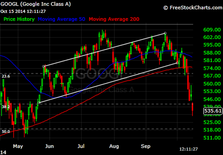
To those playing the home game, I know that some of the terms I throw around must be confusing - moving averages, ranges, etc. However, these terms and concepts are important. Let's cover the moving average today as this Google chart illustrates the importance of those lines.
Look at the chart. See how the pattern seemed to hover inside the drawn lines for quite some time? That is...until the stock broke the red line, which was the 200 Day Moving Average or 200 DMA. A moving average is the price action of that time period smoothed out, sort of like throwing out the high and low scores in a judged competition like gymnastics or figure skating. After Google broke that red line, it's been an ugly drop down.
Look at the chart. See how the pattern seemed to hover inside the drawn lines for quite some time? That is...until the stock broke the red line, which was the 200 Day Moving Average or 200 DMA. A moving average is the price action of that time period smoothed out, sort of like throwing out the high and low scores in a judged competition like gymnastics or figure skating. After Google broke that red line, it's been an ugly drop down.